↑
Nori Page
Web Design · Booking · Responsive

Vagabond Cruise

Making a large experience catalog easier to explore and book

Role
Sr. Web Designer
Timeline
3 weeks · Discovery through developer handoff
Team
Website design by Nori Page and Jeff Lau
Scope
Discovery, information architecture, responsive web design, activity discovery, booking UX, and scalable content patterns

Overview

The challenge

Vagabond’s existing website had historically converted well, but its visual design had become dated and its growing activity catalog was harder to navigate.

The redesign needed to modernize the experience without disrupting valuable search content, established booking behavior, or meaningful differences between cruises.

The approach

I organized the experience around a simple journey:

Visual discovery → comparison → key details → booking → supporting information

The design used stronger photography, clearer activity categories, mobile-first comparison patterns, and persistent booking actions to help visitors move forward without removing valuable inventory.

The outcome

A more immersive and structured website direction that made Vagabond’s variety feel exciting and approachable rather than overwhelming.

What shaped the design

Discovery and existing performance evidence established four priorities:

  • Mobile users made important decisions relatively high on the page.
  • A previous mobile activity-grid test increased conversion from 9.00% to 13.26%.
  • Visitors needed to compare a large number of genuinely different experiences.
  • Vagabond’s onboard amenities and vessel quality were not immediately visible in the existing experience.

The redesign therefore focused on hierarchy and comparison rather than simply reducing the number of choices.

Key design decisions

01

Lead with the experience

Large photography and video replaced lengthy introductory copy as the primary storytelling tool.

Imagery showed the complete experience—including guests, wildlife, vessels, seating, interiors, food, drinks, and destinations—so visitors could better understand what differentiated Vagabond from smaller operators.
Responsive homepage, rendered from the final Figma frames. Scroll inside each frame.
02

Reduce perceived choice, not meaningful inventory

Vagabond’s catalog included cruises with different audiences, schedules, vessels, and value propositions. Combining those products would have made the website cleaner at the expense of customer understanding.

Instead, activities were grouped into clear categories and presented through a consistent comparison system.

Cards surfaced information such as:

  • Starting price
  • Duration
  • Departure time
  • Vessel
  • Key inclusions
  • Seasonal availability
  • Ideal audience
Activity categories
Comparison cards: price, duration, vessel and booking in one consistent format
03

Design mobile as the primary decision experience

Existing testing showed that a scannable activity grid outperformed a slideshow on mobile.

The redesigned experience prioritized activity grids, vertical imagery, concise content, important products near the top, and persistent booking actions. Mobile was treated as its own browsing experience rather than a compressed desktop layout.

Desktop: the navigation and Search By Date stay fixed while the page scrolls.
Book Now
Mobile: the header stays fixed at the top and Book Now stays pinned to the bottom.
Both frames scroll on their own. Hover to pause and scroll yourself.
04

Surface booking information earlier

Activity pages reversed the existing content-heavy hierarchy.

Strong imagery, price, duration, schedule, vessel information, key inclusions, and the primary booking action appeared before extensive descriptions and SEO content. Visitors who needed more information could continue into itineraries, FAQs, reviews, galleries, and policies farther down the page.

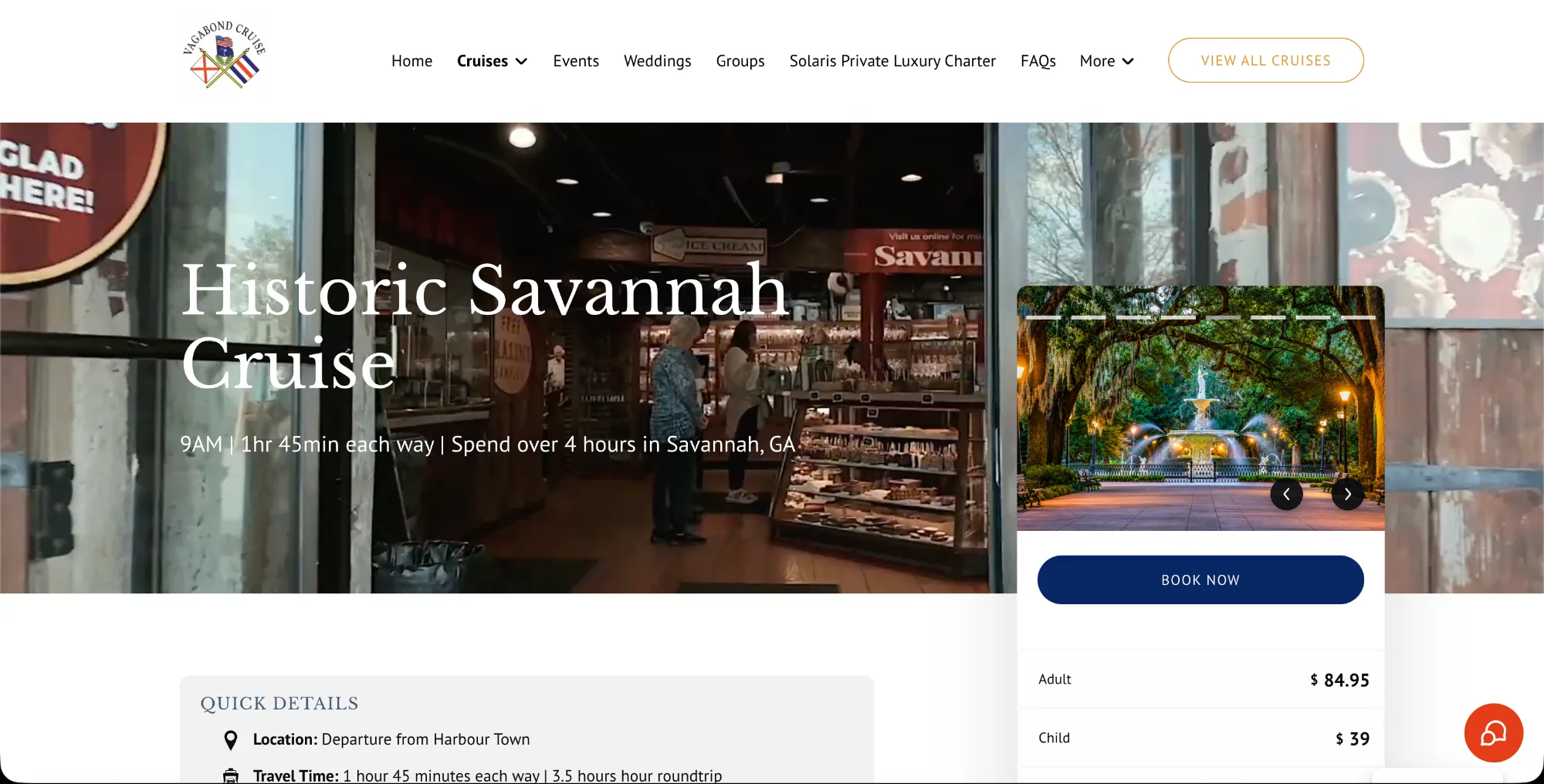
Before · current site
Current Vagabond Historic Savannah Cruise page, top of page
Current page: a full-width video hero fills most of the first screen. Quick details and most pricing start below it.
After · redesigned activity page
Historic Savannah: price, schedule, vessel and Book Now sit above the fold.
Mobile, first screen
Visible before scrolling
Hero imagePriceDurationDeparture timeVesselKey inclusionsBook Now

Itineraries, FAQs, reviews, galleries and policies follow below for visitors who need more detail.

05

Keep Search by Date useful but secondary

Search by Date helped visitors see what was actually available during their stay, reducing the need to open activity after activity.

It was positioned below the main category and activity discovery experience rather than dominating the hero, preventing the website from feeling like a hotel-booking interface.

Search by Date sits beneath the hero as a secondary tool: date, guests and cruise class, with category discovery directly below.

Two private-event journeys

Private Charters and Events served two fundamentally different customer needs.

Book a private experience

Guests choosing a defined product needed visible pricing, capacity, availability, and direct booking.

Private Charters: compare group size and duration, then book directly. Scroll inside the frame.

Plan a custom event

Corporate planners, wedding groups, families, and larger parties needed inspiration and a higher-touch inquiry process.

Instead of presenting every possible configuration, the custom-event journey used photography, past-event examples, vessel options, and partner capabilities to communicate what Vagabond could create.

Custom Events: inspiration, past events and an inquiry form. Scroll inside the frame.

This separated a transactional booking task from a consultative sales journey without dividing them into unrelated experiences.

Repositioning destination experiences

The Savannah experience faced a specific positioning problem: visitors could interpret it as basic transportation rather than a complete day trip.

The goal was to communicate the value of committing a full day, not simply sell a ferry ticket.

Daufuskie presented a related naming challenge. Its terminology needed to balance customer understanding, search behavior, and experience positioning.

The page direction emphasized:

  • The boat journey
  • Onboard comfort and amenities
  • Food and beverages
  • The day’s itinerary
  • Time in Historic Savannah
  • Reviews and social proof
  • What visitors could experience after arrival
Historic Savannah: the journey, onboard amenities, itinerary and time in Savannah. Scroll inside the frame.

Visual direction

The design used the approved Vagabond wedding concept as a visual foundation and adapted it to the broader cruise experience.

The result felt elevated and immersive without becoming inaccessible or overly formal.

The system combined:

  • Blue, gold, and cream
  • Serif display typography
  • Highly legible sans-serif body text
  • Large photography and mobile video
  • Rounded components
  • Generous spacing
  • Subtle texture
  • Refined booking actions
  • Image-forward activity discovery
Vagabond blue#2C3077
Gold#DFAF2C
Cream#F2F0EF
Booking red#E33D18
Ink#010B13
Sand#F3DFBF
Palette
Display · Libre Baskerville BoldWhat Will Your Day on the Water Look Like?
Body · PT Sans RegularFrom dolphin cruises and sunset sails to dining on the water and Savannah day trips, discover Hilton Head experiences worth remembering.
Typography
The approved wedding concept, the visual foundation for the rest of the site. Scroll inside the frame.

Flexible experience system

Reusable patterns supported:

This allowed Vagabond to feature, reorder, add, or deprioritize experiences without rebuilding the site’s primary architecture.

  • Activity and category cards
  • Direct-booking and inquiry journeys
  • Persistent booking actions
  • Seasonal and special-event promotion
  • Vessel and amenity information
  • Fleet cross-linking
  • Search by Date
  • Weddings and private events
  • Destination itineraries
  • Mobile-first galleries and video
  • Supporting SEO content
Vagabond UI components: buttons, text links, badges, cards and navigation with their specs and states
UI components documented with specs and states: buttons, text links, badges, cards and navigation. Click to open full size.

Reflection

The strongest solution was not to reduce Vagabond’s inventory. It was to help visitors understand the differences between experiences and identify the right one more quickly.

The project demonstrated how existing conversion evidence, visual storytelling, and a flexible content system could modernize a successful booking journey without unnecessarily reinventing it.

Next project UFO Parasail Web Design · Responsive View case study →
UFO Parasail device mockup